SUMMARY
Client: Liloff Energi
Sector: Ventilation & Energy Efficiency
Case: graphic identity / branding / layout & print production art
Product: logotype / printed matter / marketing materials
Production company: Majority Design
My role: graphic design / layout & print production / web design
Credits: Ellie Nordfelt, web development
Year: 2016
The Ask
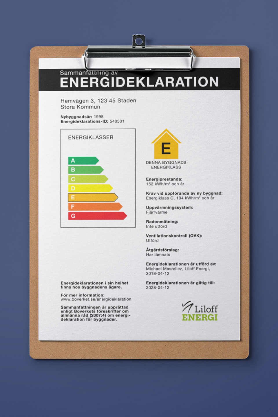
Liloff Energi needed a logotype along with business cards as they started up their new company in 2016. They are experts in mandatory ventilation inspections, energy performance certificates and operational optimisations due to their many years of expertise. I helped them out with some graphic design as they were about to start up.
The Solution
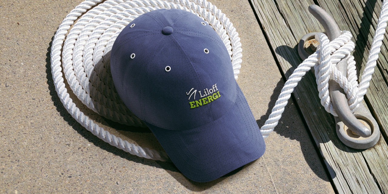
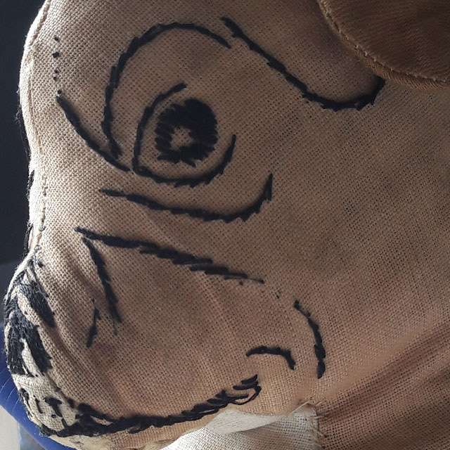
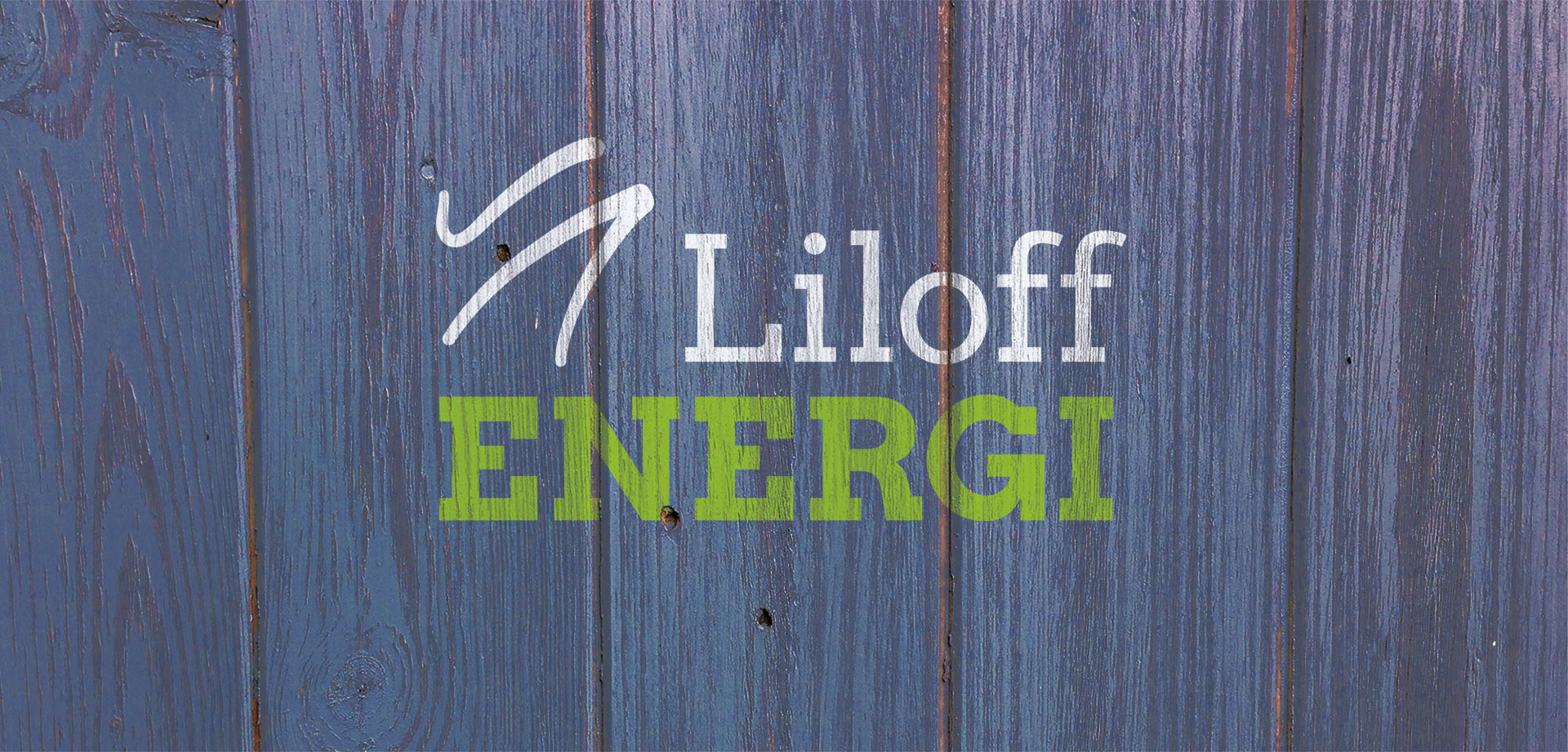
The idea behind their name comes from the owner’s mascot called Liloff, a soft toy bulldog with embroidery details. I got inspired by the shapes of the embroideries around its nose when I made the logotype, and created a clean but lively abstract symbol. The tint of green wakes one up and tells of environmental consciousness. I chose to combine it with a dark marine blue, as it has seriousness to it. Together the colours express energy and safety, which are both suitable for the Liloff brand.
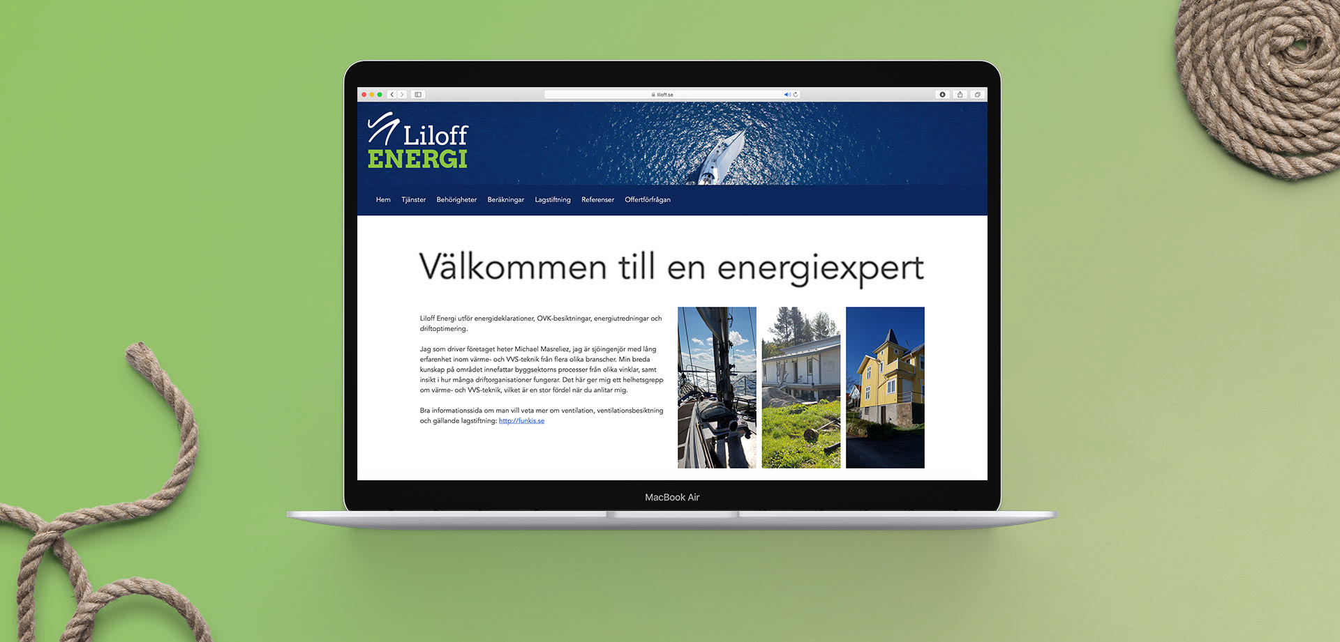
The business cards were printed on recycled paper. The website was created together with Ellie Nordfelt.